> ## Documentation Index
> Fetch the complete documentation index at: https://signalschools.co.uk/docs/llms.txt
> Use this file to discover all available pages before exploring further.
# Insights & Reporting
> Use interactive charts and filters to analyse safeguarding trends, spot patterns, and generate reports for Ofsted, governors, and local authorities.
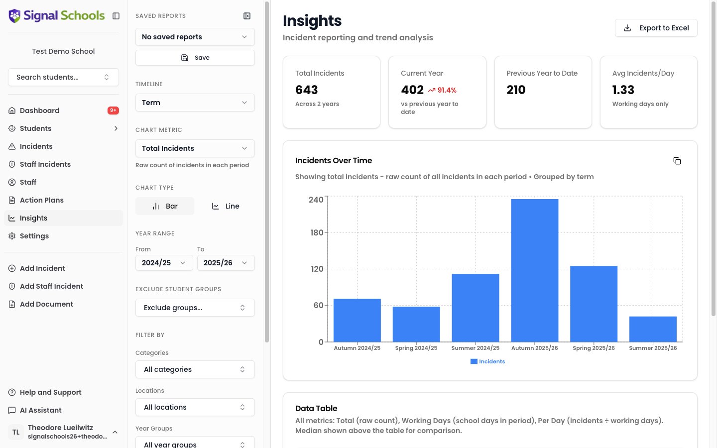
The Insights page gives you interactive data visualisations of your school's safeguarding records. Use charts and filters to analyse trends over time, identify emerging patterns, and generate the reports you need for inspections, governance, and day-to-day awareness.
 ## What you can analyse
Insights lets you explore your safeguarding data from multiple angles:
* **Incident trends over time** — see how the volume and types of incidents change week by week, term by term, or year by year.
* **By category** — understand which types of concern are most common and how they are changing.
* **By location** — identify whether certain locations (playground, corridors, off-site) see more incidents.
* **By student group** — compare incident patterns across student groups such as year groups, SEN students, Pupil Premium, or custom groups.
## Chart types
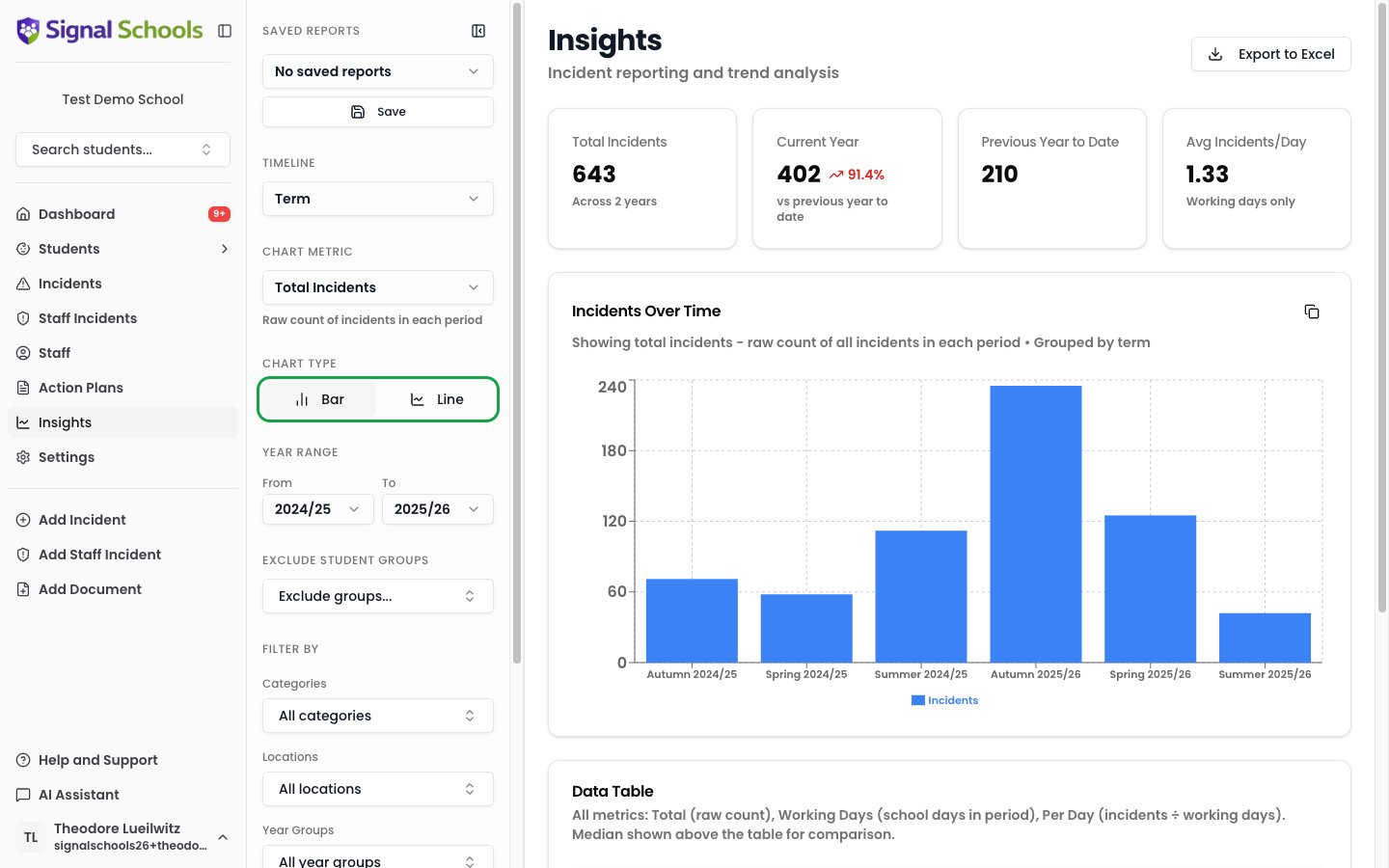
Signal offers two chart types, so you can view your data in the way that makes most sense:
* **Bar charts** — compare values side by side, ideal for seeing category breakdowns or comparing time periods. When viewing grouped data, toggle between **stacked** and **grouped** layouts to see proportions or direct comparisons.
* **Line charts** — track trends over time, showing how numbers rise and fall across weeks or terms. Enable **stacking** on a line chart to display filled area visualisations, useful for seeing volume and proportions over time.
You can switch between chart types at any time to find the view that tells the clearest story.
## What you can analyse
Insights lets you explore your safeguarding data from multiple angles:
* **Incident trends over time** — see how the volume and types of incidents change week by week, term by term, or year by year.
* **By category** — understand which types of concern are most common and how they are changing.
* **By location** — identify whether certain locations (playground, corridors, off-site) see more incidents.
* **By student group** — compare incident patterns across student groups such as year groups, SEN students, Pupil Premium, or custom groups.
## Chart types
Signal offers two chart types, so you can view your data in the way that makes most sense:
* **Bar charts** — compare values side by side, ideal for seeing category breakdowns or comparing time periods. When viewing grouped data, toggle between **stacked** and **grouped** layouts to see proportions or direct comparisons.
* **Line charts** — track trends over time, showing how numbers rise and fall across weeks or terms. Enable **stacking** on a line chart to display filled area visualisations, useful for seeing volume and proportions over time.
You can switch between chart types at any time to find the view that tells the clearest story.
 ## Interacting with charts
### Drill-down
Click on any data point in a chart to see the underlying student list. This lets you move from a high-level trend directly to the individual students involved, so you can investigate further or take action.
### Stacked vs grouped
When your data is broken down by a grouping (such as category or year group), toggle between **stacked** and **grouped** views:
* **Stacked** — bars or areas are layered on top of each other, showing the total and each group's contribution.
* **Grouped** — bars are placed side by side, making it easier to compare individual groups directly.
### Historical analysis
Toggle **historical analysis** to compare data across different time perspectives:
* **Cohort** — follow the same group of students over time, regardless of which year group they move into.
* **Class/Year snapshot** — compare the same year group across different time periods, even though the students in that group change each year.
## Filtering your data
Use filters to narrow your data down to exactly what you need:
* **Date range** — select a specific time period, from a single week to a full academic year.
* **Categories** — focus on specific types of concern.
* **Locations** — filter by where incidents occurred.
* **Student groups** — analyse patterns for specific groups of students.
* **Year groups** — focus on particular year groups or compare across the school.
Filters can be combined, so you can answer specific questions like "How many Physical incidents were logged for Year 7 students in the autumn term?"
## Day-to-day awareness
Insights helps you stay on top of emerging patterns as part of your regular safeguarding practice:
* Spot increases in particular types of concern before they become trends.
* Identify students or groups that may need additional support.
* Monitor whether interventions and action plans are having an effect.
Check Insights regularly — weekly or fortnightly — to stay on top of emerging trends rather than waiting for formal reporting deadlines.
## Formal reporting
When you need to produce reports for external audiences, Insights gives you the data you need:
* **Ofsted inspections** — demonstrate your school's safeguarding picture with clear, data-backed visualisations.
* **Governor reports** — present termly safeguarding summaries with professional charts.
* **Local authority returns** — pull together the data required for statutory reporting.
Learn how to export data, save report configurations, and share charts.
## Interacting with charts
### Drill-down
Click on any data point in a chart to see the underlying student list. This lets you move from a high-level trend directly to the individual students involved, so you can investigate further or take action.
### Stacked vs grouped
When your data is broken down by a grouping (such as category or year group), toggle between **stacked** and **grouped** views:
* **Stacked** — bars or areas are layered on top of each other, showing the total and each group's contribution.
* **Grouped** — bars are placed side by side, making it easier to compare individual groups directly.
### Historical analysis
Toggle **historical analysis** to compare data across different time perspectives:
* **Cohort** — follow the same group of students over time, regardless of which year group they move into.
* **Class/Year snapshot** — compare the same year group across different time periods, even though the students in that group change each year.
## Filtering your data
Use filters to narrow your data down to exactly what you need:
* **Date range** — select a specific time period, from a single week to a full academic year.
* **Categories** — focus on specific types of concern.
* **Locations** — filter by where incidents occurred.
* **Student groups** — analyse patterns for specific groups of students.
* **Year groups** — focus on particular year groups or compare across the school.
Filters can be combined, so you can answer specific questions like "How many Physical incidents were logged for Year 7 students in the autumn term?"
## Day-to-day awareness
Insights helps you stay on top of emerging patterns as part of your regular safeguarding practice:
* Spot increases in particular types of concern before they become trends.
* Identify students or groups that may need additional support.
* Monitor whether interventions and action plans are having an effect.
Check Insights regularly — weekly or fortnightly — to stay on top of emerging trends rather than waiting for formal reporting deadlines.
## Formal reporting
When you need to produce reports for external audiences, Insights gives you the data you need:
* **Ofsted inspections** — demonstrate your school's safeguarding picture with clear, data-backed visualisations.
* **Governor reports** — present termly safeguarding summaries with professional charts.
* **Local authority returns** — pull together the data required for statutory reporting.
Learn how to export data, save report configurations, and share charts.